Chicago crime maps look simple at first glance - colored dots on a grid, numbers that go up and down, heat maps that glow red in some neighborhoods and stay pale in others. But if you take them at face value, you’ll miss the real story. These maps don’t show crime the way it happens. They show what gets reported, what gets logged, and what the system chooses to track. To understand what’s really going on, you need to know how the data is made, where it falls short, and what’s missing entirely.
Where Chicago Crime Data Comes From
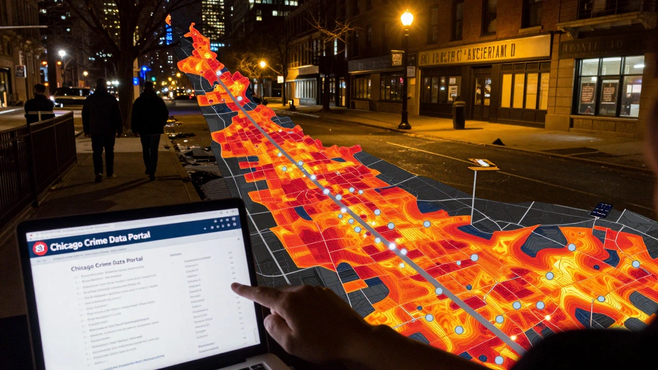
The Chicago Police Department (CPD) collects crime reports through 24/7 dispatch calls, citizen reports, and officer field stops. Every incident - from a stolen bicycle to an aggravated battery - gets logged into the Chicago Crime Data Portal a public website maintained by the City of Chicago that provides downloadable crime reports dating back to 2001. This portal is the starting point for most people using crime maps.
But here’s the catch: not all crimes get reported. A 2023 study by the University of Chicago’s Crime Lab found that only about 40% of violent incidents in high-poverty neighborhoods were reported to police. People don’t call because they distrust the system, fear retaliation, or think nothing will be done. That means the map you’re looking at is missing more than half the picture in some areas.
Also, the system classifies crimes using standardized codes. A fight might be logged as "simple battery," while a stabbing is "aggravated battery." But the difference between those two isn’t always clear in real life. What matters isn’t just the label - it’s the context. Was it a bar fight after closing? A domestic dispute? A gang-related attack? The map won’t tell you.
How to Use the Official Chicago Crime Map
The official Chicago Crime Data Portal lets you filter by date, type of crime, and neighborhood. Here’s how to use it effectively:
- Go to the portal and select a date range - at least the last 6 months to see patterns, not just spikes.
- Filter by crime type. Don’t just look at "all crimes." Focus on violent crimes: assault, robbery, homicide, and sexual assault. Property crimes like theft and burglary are common, but they don’t tell you about safety in the same way.
- Zoom into specific blocks. Crime isn’t spread evenly. A single block might have 15 reports while the next one has none.
- Turn on the "incident details" layer. Each dot has a link to the report. Click a few. Read the narrative. Was it a drug arrest? A domestic disturbance? The details matter more than the color.
Use the map to spot trends, not to label neighborhoods. A spike in one month might be tied to a single event - a festival, a police operation, or a seasonal shift. Look at year-over-year changes instead of month-to-month.
The Big Blind Spots
Chicago crime maps are built on police data - not community experience. That creates three major blind spots:
- Underreporting: As mentioned, many crimes go unreported. This is especially true in immigrant communities and among victims of sexual violence.
- Over-policing: Some neighborhoods have more police presence, which leads to more arrests and more reports - even if the actual crime rate hasn’t changed. A high number of reports doesn’t always mean more crime.
- Missing data: The map doesn’t include incidents handled by other agencies. Fire department calls for domestic disturbances, school incidents, or hospital admissions for assault injuries aren’t counted. That’s a huge gap.
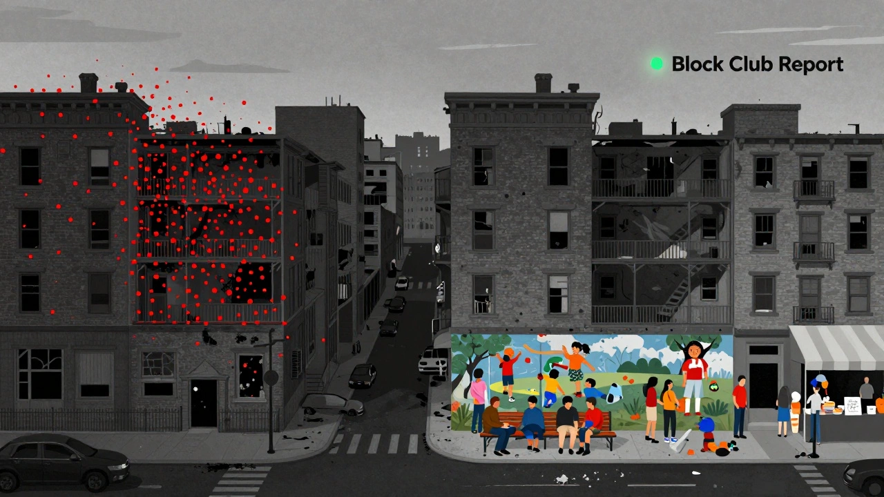
There’s also no data on quality of life issues that impact safety - like broken streetlights, abandoned buildings, or lack of public transit. These aren’t crimes, but they make people feel less safe. And feeling unsafe affects how people live, work, and move through the city.
What the Maps Don’t Show: Context Matters
Two neighborhoods might have the same number of reported crimes, but one feels safer because of community centers, active block clubs, and street vendors who know their neighbors. The other feels dangerous because of long empty blocks, no streetlights, and no place to sit outside.
The Chicago Community Trust has spent years mapping social capital - how connected neighborhoods are - and found a strong inverse relationship with violent crime. Where people know each other, trust each other, and have places to gather, crime drops. Maps can’t capture that.
Also, economic factors play a huge role. Areas with high unemployment, poor school outcomes, and low homeownership often show higher crime rates. But that doesn’t mean the people living there are more dangerous. It means the systems that support safety - jobs, education, housing - are weaker.
Tools That Go Beyond the Official Map
If you want a fuller picture, look beyond the CPD portal:
- Block Club Chicago - A community-driven platform where residents report local issues, from suspicious activity to potholes. It’s not crime data, but it shows what people are worried about.
- Chicago Crime Report - A nonprofit project that combines police data with demographic info like income, education, and housing density. It helps you see whether crime rates are higher because of poverty, not because of people.
- OpenStreetMap - Use it to overlay crime data with real-world features: parks, schools, bus stops, liquor stores. You’ll start to see patterns - like how crime clusters near transit hubs or stays low near schools with after-school programs.
Some people use third-party apps like Safewise or SpotCrime. These are fine for quick checks, but they pull data from the same CPD source. They don’t add insight - just a different color scheme.

What to Do With This Information
Don’t use crime maps to avoid neighborhoods. Use them to ask better questions.
- If a map shows a spike in thefts near a bus stop, ask: Are there cameras? Is there a community watch? Are there more buses running at night?
- If a neighborhood has high homicide rates, ask: What’s the unemployment rate? How many youth programs exist? Are there enough social workers?
Crime maps are tools for public accountability - not verdicts. They should be used to push for better resources, not to write off whole communities.
Real safety comes from investment - in schools, in housing, in mental health services, in community-led patrols. Maps can show where those investments are needed. But they can’t make them happen.
Final Thought: Maps Don’t Tell the Whole Story
A crime map is like a weather report that only shows rain - not wind, not humidity, not how well the buildings are built. You can see where the storm hit, but you won’t know why some homes stayed dry while others flooded.
Chicago’s crime data is valuable. But it’s not the whole truth. The truth lives in the stories of people who walk those streets every day - the store owner who knows every regular, the teacher who stays late to help kids, the neighbor who checks in on the elderly woman down the block.
Use the maps. Understand their limits. Then go beyond them. Talk to people. Ask why. Look for the systems that make safety possible - not just the ones that record what breaks.
Are Chicago crime maps accurate?
Chicago crime maps are accurate in recording reported incidents, but they don’t capture unreported crimes. Studies show that up to 60% of violent crimes in some neighborhoods go unreported. The maps also don’t reflect context - like whether police presence is high because crime is high, or because the area is over-policed.
Why do some neighborhoods show high crime rates but feel safe?
A neighborhood might have high crime reports because it has more police, more reporting, or more foot traffic that leads to more incidents being logged. But if residents know each other, have strong community organizations, or benefit from local programs, they may still feel safe. Safety isn’t just about numbers - it’s about trust, connection, and access to resources.
Can I use crime maps to decide where to live?
Crime maps can be one factor, but they shouldn’t be the only one. Look at public services, school ratings, walkability, and community engagement. A neighborhood with moderate crime but strong block clubs and active local government may be safer than one with low crime but no community ties. Talk to residents. Visit at different times. Data tells part of the story - lived experience tells the rest.
What’s the difference between violent crime and property crime on the map?
Violent crimes - like assault, robbery, and homicide - directly threaten personal safety. Property crimes - like theft, burglary, and vehicle break-ins - damage possessions but rarely involve direct harm to people. For assessing personal safety, focus on violent crime trends. Property crime is more about opportunity and prevention, not danger.
Do crime maps show gang activity?
No. The Chicago Police Department doesn’t classify crimes by gang affiliation in public data. Even if a crime is gang-related, it’s logged as "aggravated battery" or "robbery." To understand gang influence, you need to look at local news, community reports, or court records - not the public crime map.